Justin O’Beirne ha notato che la cartografia di Google Maps è cambiata notevolmente negli ultimi anni: le strade si sono fatte più prominenti, mentre molte delle città un tempo segnalate sono sparite dalle mappe.
Mettendo a confronto due mappe dell’area di New York, una del 2010 e una del 2016, si nota come la prima ponga un’enfasi sui nodi (le città) e di come la seconda, invece, si concentri più sulla rete (le strade):
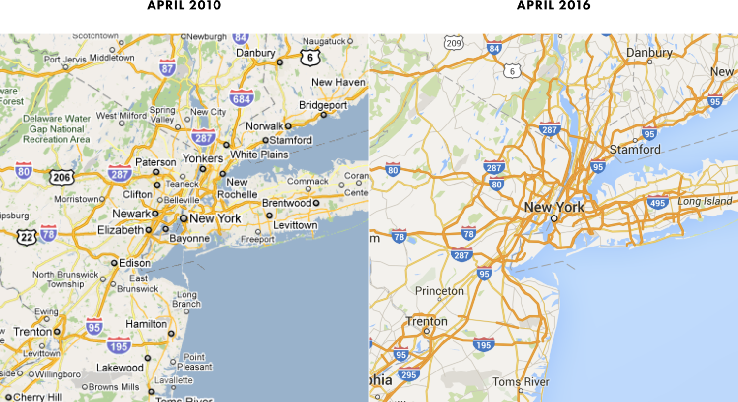
Nessuna delle due, però, è particolarmente usabile o utile. Se vi capitasse di perdervi nell’area è probabile che anche quella del 2016 non vi servirebbe a molto: riporta i nomi di solo 8 città, contro la prima che ne segnala segnala 46.
Il cambiamento è avvenuto probabilmente a causa dello smartphone — della necessità di rendere la mappa leggibile anche su schermi piccoli. Scrive Justin:
Given these trends, it’s likely that Google Maps was optimized for mobile — and this explains some of the changes we observed earlier.
Unfortunately, these “optimizations” only served to exacerbate the longstanding imbalances already in the maps. As is often the case with cartography: less isn’t more. Less is just less. And that’s certainly the case here.
Google should add some of the cities back to its maps, and the maps would be better and more balanced.
I hope that they do.